Digital scrapbooking tutorial :: Customising a digital page template
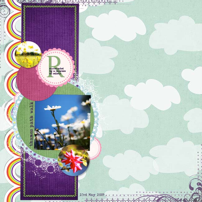
Digital templates help create great pages in a flash while still giving you the ability to customise the look. This layout starts with Scrap Canvas 10 by The Queen of Quirk.
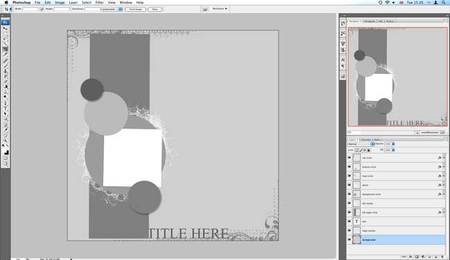
1. Open the layered page template file (.psd) in Photoshop or Photoshop Elements. It will look something like this.
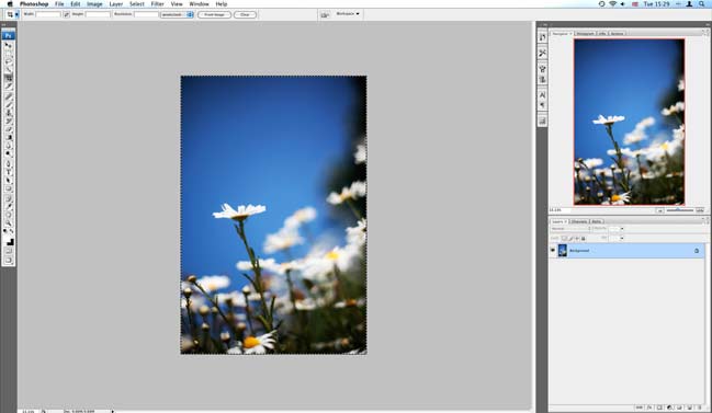
2. You can start with any element on the page. I like to start by putting the photos in, so I can see if the papers match as I go along. Open the photo in the same program, select all or part of the photo that you want to use (ctrl+a will select everything…or use the marquee tool to select just what you want). Copy (ctrl+c).
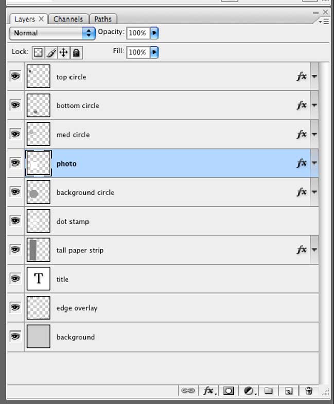
3. Click back to the page template and look at the layers on the right. Click on the photo layer so it is active.
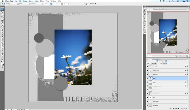
4. Paste (ctrl+v). This will make a new layer with your copied picture, and the new layer will be sitting on top of your photo. You can move the photo around on the canvas by clicking the arrow tool at the top of the toolbar, then just dragging it where you would like it. You can change the size with the transform function – ctrl+t. Hold down the shift key and drag from the corner so it won’t stretch or distort. Hit enter or click the checkmark when you are done transforming to commit to the changes.
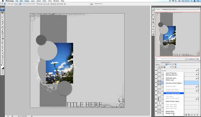
5. Once your photo is roughly in place, right click on that layer and you should see a variety of options. Select ‘create clipping mask’ or ‘group with previous’ (the functions act the same for this purpose but have different names in different editions of PS/PSE. This will make your photo only visible in the photo spot of the template. You can still move the photo and transform its shape if it’s not in quite the right place.
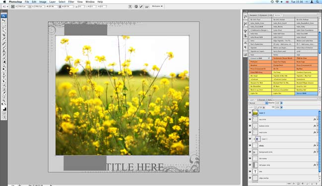
6. Repeat steps 3, 4 and 5 for any additional photos you want to include.
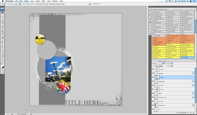
(I added two more photos to circles on the template – but you can fill these with patterned paper if you prefer.)
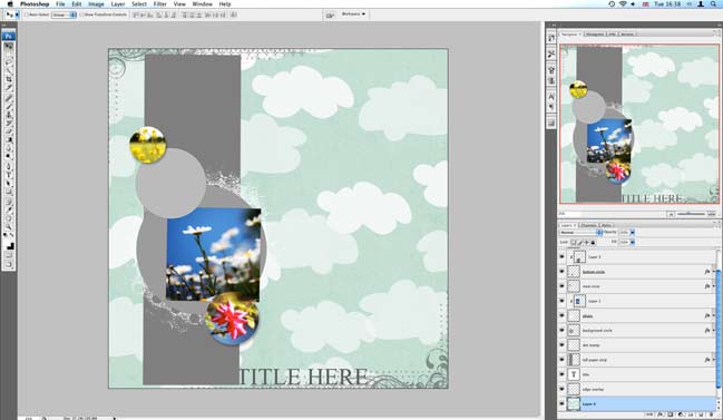
7. With our photo(s) in place, now let’s add some paper. Open the paper you would like in the background, select all (ctrl+a) and copy. Click back to your layout, click on the very bottom layer and paste. You should now see your paper with the template sitting on top! (If your layer isn’t in the right place, just click and drag to move it to the right spot.)
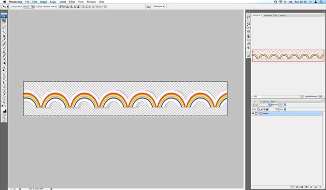
8. And here’s where we start customising things a bit. To go with today’s rainbow theme, I wanted to add a rainbow border. Open the file, select all and copy.
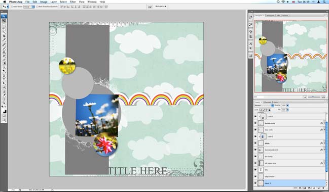
9. Click back to your layout and paste. Now your border should appear on your layout, but it will need to be moved into place.
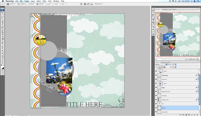
10. Use the transform function (ctrl+t) and hover on a corner to rotate the border into place. Hit enter or the checkmark when you are happy. Tuck the edge of the rainbow behind the large box for a clean finish.
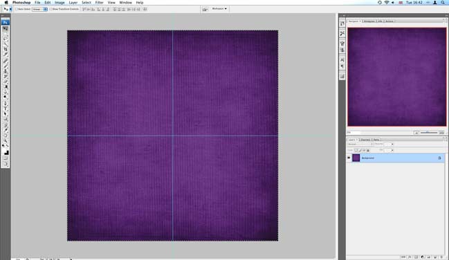
11. Open the paper you would like to use for the large rectangle in the template. Select all and copy.
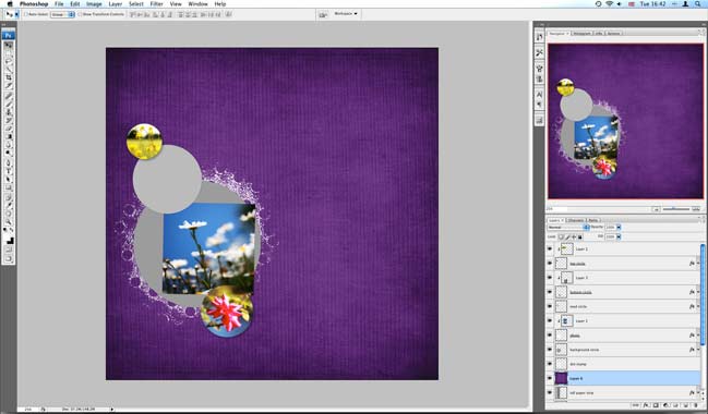
12. Click back to your layout, click on the ‘large paper strip’ layer and paste. This should add your paper to a new layer just above the big box.
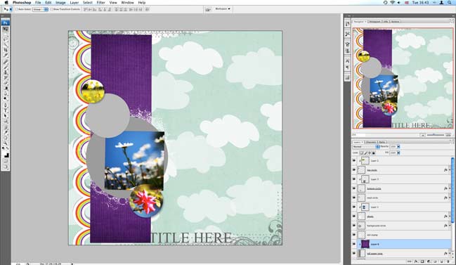
13. Right click on the new layer and select ‘create clipping mask’ or ‘group with previous’ to snap it into place. Presto.
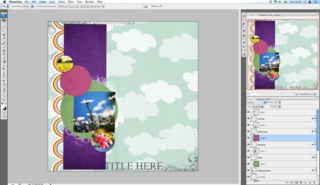
14. Repeat steps 11, 12 and 13 for all the papers and spots on the template you need to fill.
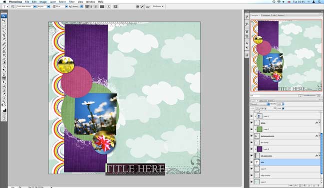
15. To change the title to something other than ‘title’, just click on the title layer, then click on the type tool and click on the word title on the layout. Then you can type in what you want, change the font, the colour, the size, etc. I end up changing mine again later in the layout!
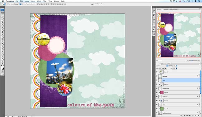
16. Use your other digital supplies to further customise your page, if you fancy. Just open the elements you want, select all, copy and paste them into your layout. Move them around – both on the page and in the layers palette until you have things where you want them, like the pink scallop circle.
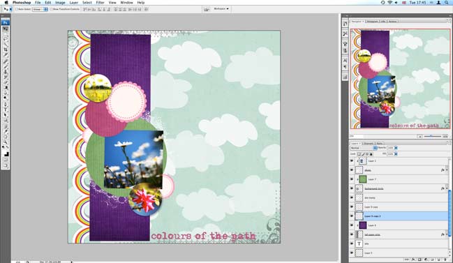
17. If you want to add more of the same accent, you can either paste it again or duplicate the layer and move it around. The handy thing about digital is you can use the accent as many times as you want – in any colour, any size – and you don’t have to go back and buy another pack of that embellishment.
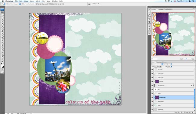
18. To change the colour of the ornate border around the page, paste in a paper of your choice in the layer above the border and use that clipping mask/group with previous function again. You can change the opacity on both layers until you’re happy. The opacity slider is just above your list of layers.
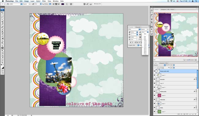
19. To add additional text, just click with the type tool and add whatever you would like. You can use the type settings to adjust spacing and size, or you can go back to the arrow tool and use transform to just change size (that won’t change individual elements – but it is helpful to tweak something a little bigger or a little smaller to fit in a certain space) or angle.
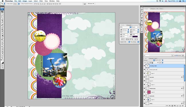
(And here’s when I changed the title to just be the date.)

20. Almost done – but that pink circle was looking too empty for me! To add a monogram, use the type tool and type in a big letter.
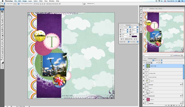
21. You can add colour and texture by using that as your mask! Copy the paper you want (I used the same green as in the big circle), paste it into the layer above your letter, and use the clipping mask/group with previous trick again.
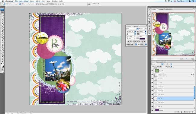
22. Last touches – a little more text layered over that monogram and stitches pasted around the purple box.
So still pretty easy…but a little different than the original template, so you can use the same template over and over and make it different each time. Next time just move a little more…rotate the canvas…change the size of a circle…whatever you fancy!
Now…don’t miss out on the challenge—use this template or the rainbow border on a project this month and you can win $15 to go shopping!
xlovesx
![]() Read more about: colour
Read more about: colour
Next post: How to use a digital photo mask
Previous post: Ten Scrapbooking Supplies I Can't Live Without


