pretty paper. true stories. {and scrapbooking classes with cupcakes.}

lovely to meet you Twitter Facebook Pinterest YouTube

Take a Scrapbooking Class

online scrapbooking classes

Shop Shimelle Products

scrapbook.com simon says stamp shimelle scrapbooking products @ amazon.com shimelle scrapbooking products @ amazon.co.uk

Reading Material

travel

Scrapbook Starting Points Category

Scrapbook Starting Points :: Life with the Pink Backpack

scrapbooking starting point @ shimelle.com
If you open a box of new supplies and are filled with a small terror that there is no easy place to start, you are not alone. I often find I look at all those fresh paper sheets and I’m not sure exactly where to go from there – perhaps for fear of messing up a much-loved sheet of paper, but more likely for an overrun of ideas and the worry that if I cut into a sheet that could be perfect for a background, I’m not sure where I’ll go after that. Usually I just have to start something, anything, and then go from there, living with the consequences of whatever pieces are left from the papers after they are cut. And this starting point is just that sort of project.

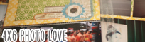
Select one patterned paper as the background and keep it 12×12. Cut another to 8×8, and attach in one corner. Choose a paper with a design that can be cut into a horizontal strip to run across the bottom of the 8×8 block. Cut a block from another patterned paper in a size that will be slightly larger than your photo, and run that vertically, above your horizontal strip. Add a die-cut to the mix at the spot where those different paper elements join. Find the diagonal across your page design and add a few droplets of mist at the ends of that imaginary diagonal line. From here you can add anything you want: photos, title, writing, more embellishment… take it as you would like!

scrapbook page by shimelle laine @ shimelle.com
My finished version includes some of the die-cuts from the Sundrifter pack in the kit – which turns out to include stickers really. There was no mention of that on the packaging that I could see, so I was somewhat surprised. The mistable Thickers can be sprayed to any colour you would like, but I wanted to add a bit more white to lighten the top of the page, so I just used them as they were. I used three of the different sentiments from the stamp set, and the ‘all of us’ below the photo is a rub-on from the Instaframes pack.

This page is a great example of a warm-up. When I’ve taken a little break from scrapping (which in my world is often a couple days, but the same principle works for much longer breaks too), I need something that is simple, colourful, and lets me get all the important elements onto the page without a huge element of creative challenge. I think this is honestly a really important part of my creative process, and it really helps me scrapbook in the morning specifically, as I am not a morning person, but that’s often when my scrapping time is found. Your warm-up page design might be a very different look, but the same concept can apply if you find a design that you love and you could almost put together without looking. Just something to keep in mind. If you get that new paper paralysis, jump in somewhere and remember there is always more pretty paper in your world, so there’s no need to panic if you cut into a sheet that could have been a fabulous 12×12 background. There are plenty more fabulous 12×12 backgrounds, I promise.

A very happy Monday to you, and may the sun be shining at least a little bit in your part of the world! I have a variety of projects to share with you over the next few days with the May Best of Both Worlds kit, and thought we might start with a starting point! As good a place as any, right?


break it down scrapbooking project from shimelle laine
Today also marks the start of a six week scrapbooking project I’m leading at UKScrappers. You can find that project here, including the first prompt and a thread to introduce yourself. There’s no charge to join UKScrappers or to participate in the project. Though the site is certainly about scrapbooking for those in the UK, any scrapper is welcome to join and participate, regardless of where you live. Find all the details about Break It Down at UKS.

Scrapbook Starting Points :: Subtle Patterned Backgrounds

scrapbook starting point by shimelle laine @ shimelle.com
Time to crack open this February edition of goodies and get to some scrapbooking – and also a big thumbs down to flu bugs right now, yes? Anyway, moving on.

This starting point is one of my favourite ways to use a subtly patterned background that I still want to be easily visible. Plus I love baby blue (or turquoise) with red. Such a lovely combination – just a twist on classic red, white, and blue. (In fact, I love it so much I’ve written about it already as a scrapbooking colour story.) For this starting point, you just need that background pattern in the full page size, plus three more pieces: one 4×11 inch rectangle (I added some plain white cardstock from my scraps here), one 5×5 square (the red chevron pattern), and one 1×11.5 inch strip (the black and white arrow print).

This design leaves plenty of pattern on show and has a variety of places to start adding your page elements, so it could feature one square picture on the red box, for example, or a landscape photo to the right, or a row of small prints across the top of the page. I chose three photos for my page.

scrapbook page by shimelle laine @ shimelle.com
These were originally 4×6 landscape images, but I cropped them to 3.5 square to focus a bit more on what changes in each picture, so they read as the process. In theory, anyway! I like how there is a bit of extra title work here – that the Thickers, the accent card, and the red stickers down the side all contribute to the general idea of the page, but then that ‘remember this’ sticker at the top left leads into the angle for the writing. I wanted to focus on how this is our routine every morning and has been for a few years, but write it in a way that if years from now this ritual has fallen by the wayside for something quicker or simpler, that at least there is evidence of how much this was a part of our day for many years. (I suppose that is a bit of breaking the fourth wall in scrapbooking – when your journaling admits it is in a scrapbook!)

If you fancy a rather ridiculous look at how this page came together, I snapped it with Vine throughout, which you can see here. Vine is a bit like a video version of Instagram, in that it’s a social media app that lets you use your phone to share images, except rather than still pictures, it’s six seconds of video that plays in a loop. You can’t edit it in another app or anything – it’s just six seconds to fill and then you get what you get. Suffice to say, six seconds makes a layout really fast!

How would you finish a page with this starting point? Give it a try and share your results! You’re welcome to use any supplies – you don’t have to use the Best of Both Worlds kit to join in the fun, but of course you can if you would like!


Scrapbook Starting Points :: Four Small Photos

scrapbook page by shimelle laine @ shimelle.com
This morning I had every intention of being on the train into the city nice and early so I could do one of those very rare things in my world and work with people actually in person instead of through email inboxes. Except it has snowed and snowed and snowed some more this past weekend, and the trains in our corner of London are not running. So instead, I am scrapbooking. I think I can cope with that idea, provided we can reschedule our day of working in person for sometime soon.

scrapbooking starting points @ shimelle.com
As a result of that, here’s a starting point! It started with a full sheet of patterned paper for the background, two narrow strips (they were the two off-cuts from that large square on the last sketch layout), and two 4×6 cut-apart cards, plus an off-cut of what was left of the camera print in the middle. Everything here is still from my January kit of supplies – this is the fourth page to come from that stack of goodies so far.

scrapbook page by shimelle laine @ shimelle.com Oh snow, you have taken away all the natural light. Perhaps I can rephotograph this soon.

Almost everything on the completed page is still from those supplies – including lots of the button card used to create the bunting. I added the thread to finish that detail plus gold and black mists and three pink enamel dots for that little row of embellishments in the middle. The stamped ‘Happy’ words at the right are just stamped with regular black ink, but faded to match the ombre pattern of the striped paper by simply adding more pressure or stamping off some of the ink.

Once this was finished, the combination of the tall narrow strips and the small photos reminded me of this sketch, though there are certainly a few differences. Worth a comparison if you have more narrow strips left than larger boxes.

If you want to give this starting point a try, choose any papers you want and arrange them in a similar fashion to the second image in this post. Then ignore my finished layout and complete your page to suit your style and photographs. When you’re done, share your project with us so we can see all the different ways that same starting point can continue to a completed design.

Have a great week – and if you get snowed in, at least you can always scrapbook!


Scrapbooking Starting Point :: All Smiles wedding scrapbook page

Scrapbooking Starting Point :: All Smiles wedding scrapbook page
scrapbooking starting point
Are you ready to be amazed? I have not completely abandoned starting points! I had just a tiny bit of time to do some just-for-fun scrapping before the moving boxes arrived, so I started with this starting point for a new page: one full sheet of a subtle single-colour patterned paper, like a stripe for the background. Then everything else is arranged on the top third of the page – one 4×11 inch box, one 2.5×11.5, a smaller 4×5 box and a border-punched strip just shy of the full page width. I used my dwindling stash of Garden Cafe for this start – I love all those turquoise tones in that collection from last autumn.

wedding scrapbook page
Finished, it looks a bit like this! Some crocheted trim, that lovely rose ribbon from the first Dear Lizzy collection (I’ll admit it: I was afraid to use it and now I’m slightly ashamed that it’s still in my ribbon drawer. It may appear on a few more projects soon to make me feel much better about that situation!) and lots of paper elements from Dear Lizzy Neapolitan and 5th & Frolic (out soon!). Very pink Bella Blvd chevron tape. Plus those turquoise Amy Tangerine letters I’m using on pretty much anything that stands still at the moment.

New to Scrapbook Starting Points? You can find more here.


Scrapbooking Starting Point :: The Colour of Matsuri Days

Scrapbooking starting points
scrapbook starting points
I’ve started this week drawn to red and black, so I’ve pulled out some always lovely red and black patterns from Jenni Bowlin and added a little splash of yellow from the Studio Calico Heyday collection.

scrapbooking starting points
I started by masking and misting that red patterned background, and I covered up what I didn’t like and left what I did like on show (the polka dots at the top left, misted in Pinstripe Mister Huey spray). Then I just started at the bottom of the page and piled toward the top – three border strips, one large block and a contrasting 6×6 paper on top of the stack. Everything is edged in a dark brown, to be a bit less harsh than black ink.

scrapbooking cropped photos
And now for a little tangent: I get a great many questions about why I don’t include more photos per page, and the most direct answer is just because I don’t like it. I like my photos at 4×6, and for the most part I like one to three of them per 4×6 page. I have plenty of exceptions to that, but that size is what works best for me. I have two connotations with page designs that really focus on including lots of images: my eyes can’t take them all in with so many images per page, which makes me feel a bit uneasy (even with significantly less embellishment than usual) and it reminds me of the sort of scrapbooking that involved a triangle of paper in the corner and competing for how many pages you could complete at a crop. I know that is fun for some scrappers – I’ve seen them relish it! It is not fun for me. It is stressful and foreign and uncomfortable for me. Just like ink droplets might make you twitch or covering up most of a layer of patterned paper might make you shout at me through your computer screen, too many photos on a page can just make my head spin because it’s not what I love. And I’m not going to make things I don’t love for the sake of a blog post or a video – so I’m afraid you’re stuck with a hefty dose of pages featuring one to three 4×6 prints! Since I print pretty much everything at 4×6, I have had a few commenters follow up the multi-photo discussion with the idea of cropping those 4×6 pictures. I rarely do, and today I tried it just to see if it would work. It didn’t, so this works perfectly to explain.

I knew I wanted to use that landscape 4×6 print with the smiling girls, but I also wanted to include some other photos from this same festival parade in Kyoto. They were all 4×6 landscape prints and there was no cute way to feature all three at full size with this starting point, so I needed to change something. I tried cropping those two images, and cut them so they were not only smaller, but now a portrait orientation, taller than they are wide. Especially with the top photo, it seems like this is a sensible solution because she’s the only person in focus in the picture, and the landscape image has lots of ‘wasted’ space to either side of her face. The cropped version is a disaster to me: losing that calming space to either side of her made the image harsh and awkward. It doesn’t look natural or fluid, and in both pictures it makes the people look somewhat out of proportion. These cropped images were not going to make me happy in the slightest, so I went back to the original files and printed them in their horizontal style with the original cropping of the image, but just at a smaller size. Immediately the images appeared calmer, more natural and gave a more honest depiction of the memory in my mind.

End of tangent, I promise.

scrapbook page
Here’s the finished version, with those two photos printed in their original orientation but at 2×3 inches instead of 4×6, and I’m much happier with that. I built the embellishment at the top right first, then replicated many of those layers over to the left, but also added a felt bow clip for dimension and texture and a little butterfly to keep it from being too boxy with all those squares and rectangles. The bottom right corner came last and it’s far more minimal, with the hexagon numbers for the date and a little punched heart, which is allowed both because I really do love Japan and because it was our honeymoon. As if you need permission to use a heart punch. Heart punches are always allowed in my world.

Other supplies include Jenni Bowlin stickers, Dear Lizzy and Heidi Swapp letter stickers, and My Mind’s Eye washi tape.

scrapbook pages
And a few favourite pages from the last starting point, which created all sorts of multi-photo pages, by the way. For a closer look at these pages, check out the posts from Kelly, Jacky, Alison and Katja.

If you give this starting point a try, I’d love for you to share your work – you might find your layout in the favourites next time!


Scrapbooking Starting Point :: Stormy New Zealand Seas

scrapbooking starting point :: stormy new zealand seas
scrapbook page detail
A lovely Monday to you, and a new starting point to jumpstart your scrapbooking this week! The last few days I’ve been pulled back to travel photos for some pages, so the kraft cardstock has been out on my desk again.

scrapbooking starting point
I’m working my way through the Pieces of Me kit at the moment. This is the second layout to come from my kit, since Glitter Girl stole her favourites last week to make this page. But I’m aiming to use everything she left me! For this starting point, I added a sheet of kraft cardstock for my background, but the papers are from the kit, including a 4.5×12 vertical strip, two small strips for that vertical border (one punched with a large scallop) and one 4.5×6.5 box. Those two sizes give you some flexibility in where the photos will go. Does your eye go to a photo on the green box? Or photos on the pink strip? Or both? So potentially you could include three 4×6 prints here, or any number of smaller images of course.

scrapbook page
I went with two portrait 4×6 prints, then used the space at the right for my title, writing and more embellishment. Aside from the supplies, this layout has quite a few things in common with Glitter Girl’s page: two 4×6 photos, writing on a tag held in place in a paper pocket, and a triangle of accents in a contrast colour. Glitter Girl used that pop of red, but I went with aqua this time, creating a little triangle on the right side of the page between the aqua paper block, the aqua bow on the paperclip and the aqua sequins at the bottom of the page. If you like scattered embellishments but have trouble finding just the right spot for them to balance, that might be something you want to try.

I love that I could get such a varied title for this page without adding anything else to the kit. The large letter sticker sheet includes two colours in both upper and lower case, so they work as two different alpha styles here, plus the small tile letter stickers and the lettering in the stamp set. This time I stamped with Versamark ink and heat embossed with Zing powder in leaf green. (If you’re keeping track, the only things I added to the kit for this page were the kraft background cardstock, the ink and embossing powder and the coordinating leaf green Mister Huey spray.)

scrapbook pages
Last week’s starting point inspired a range of looks from one to three photos on a single page. Check out these pages and say hello to the scrappers who created them: one, two, three and four.


Scrapbooking Starting Point

scrapbooking starting points
scrapbook starting points
Good morning! Kicking off the new week with a new scrapbook starting point, and something a little different this time – one area of the page already more embellished than the rest. This is my final layout to finish from this JBS Mercantile kit, mixed with the minibook kit. But of course you can select any supplies you fancy!

scrapbook starting point
I started by trimming a half inch from two sides of the chevron patterned paper and attaching that to the middle of a sheet of kraft cardstock. Then a patterned border across the whole page, about three inches from the bottom, topped with an 8×10 portrait piece of patterned paper. Then to start this area of embellishment! Working from the bottom layer to the top, it is: a strip of patterned paper, washi tape, a vintage hotel registration card, some dark kraft cardstock, part of a border sticker with a notebook paper edge, a sticker, a journaling card, a few layers of vellum, some baker’s twine and a big sticker right on the top!

scrapbook page
I finished this scrapbook page with two 4×6 photos – one portrait, one landscape – and a smaller area of layered embellishment with the writing at the top left. Most of the pieces included there are repetition from the starting layers – the large camera repeated with a few smaller cameras in the same style, the rest of a border sticker first used at the bottom right, and so on. So although there are plenty of layers, it’s actually pretty kind on the supplies as most things can work as a little here, a little there. And I liked that there was still enough room for a title in some smallish letter stickers.

scrapbook pages
So many lovely pages were shared from the last starting point. Here are a few favourites. Click the corresponding link to take a closer look and get to know the scrappers behind these pages: one, two, three and four.

If you use this week’s starting point to create a scrapbook page of your own, I’d love for you to share it here! (By the way, I’m always looking for a nice detail shot for the round-up!)


Scrapbooking Starting Point :: Pink & Grey

scrapbook starting points
scrapbook page detail
Starting a new week with fresh energy and bountiful intentions. How are you this find morning? And would you fancy a scrapbook starting point, perhaps?

scrapbooking starting point
This starting point and resulting page comes from this month’s kits at JBS Mercantile. This includes elements from both the main kit and the minibook kit. (There are still a few of the main kits left. The mini has sold out, I’m afraid, but many of the items from that kit can be found here.)

Somewhat odd for my layouts recently, this actually requires two sheets of cardstock: one 12×12 for the background and one cut smaller to mat the two patterned paper boxes in the centre of the page. That full area in the middle pieces together to be 11.5 inches wide and 10.5 inches tall. Then a gathering of patterned paper scraps, a journaling card and some washi tape forms the start to the embellishment. But where will you go from here? Is that the space for writing, the title or more layers of pretty paper?

scrapbook page
In this case, that spot was just right for the title, and a few more layers of paper both here and at the top left balanced things out, leaving room to add writing on the green patterned paper above the title. I’d been toying with how to write about these pictures without my album starting to have a sort of farmers’ almanac twist since the pink trees turn up in my photos every spring. Then I realise the farmers’ almanac was actually pretty nifty as it goes – so each year it will document that little bit of perspective on the weather and the seasons and so forth. This year there was very little of the pink on blue and instead pink on grey, with many of the cherry blossoms struggling through since we had one week of really warm weather followed by a cold front and freezing rain. In the end I photographed these under an umbrella in a downpour because I was afraid the rain would bring all the blossoms down, but I did manage to get a few blue sky shots the next morning when we had about two hours of sunshine. So yes, apparently I’m now so engrained in British culture that I will scrapbook the weather. Next: a page about queueing, obviously.

scrapbook pages
We’ve actually had two starting points since I last posted a round-up, so here are a few favourites from those two. Click the corresponding link to take a closer look and get to know the scrappers behind these pages: one, two, three and four.

If you use this week’s starting point to create a scrapbook page of your own, I’d love for you to share it here!