Countdown Discounts: Making Albums a Magical Way
It’s so close now! One more school day. One list of things left to finish, pack, or let go. Then time for all the magic! And that’s what’s here in this countdown bundle: two classes with different formats and content that happen to fit together in their own lovely way, and will fit with something new I’ll be teaching in the not so far off times to come.
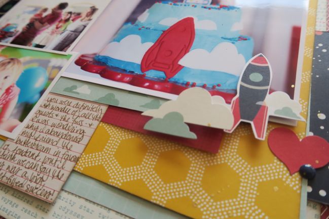
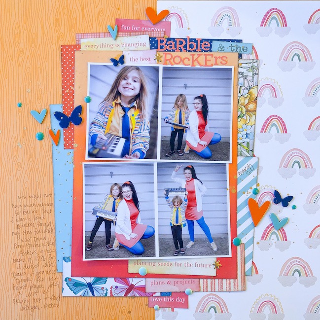
Cover to Cover is my album philosophy class. It features flip throughs of albums and a great deal of discussion of how I go from individual pages and a stack of photographs to an album that truly tells a story and reads like a book. This is my ‘put the book in scrapbook’ class.
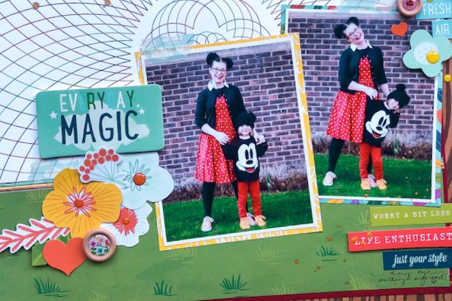
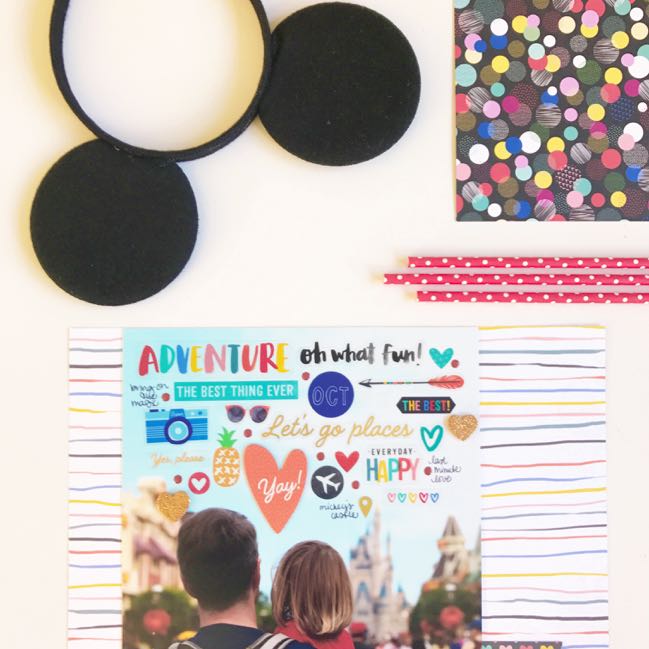
Most Magical Scrapbook is my Disney scrapbooking class, but you don’t actually have to be a Disney fan at all to follow along. It takes you through my entire process of scrapbooking a 10 day holiday including Walt Disney World and a day at Universal Studios Orlando. There are about fifty process videos that show all the 12×12 scrapbook pages from start to finish, and just like Cover to Cover suggests, I’m interested in making this a book that tells a story rather than just a box of individual pages, so you’ll see the album build and come together!
These two classes are available individually any time but they would ordinarily cost $55 USD. For the next 24 hours, you can buy the set for for just $28.
If you’ve been considering evaluating how you create your bigger library of scrapbooks rather than just stacks of pages, I will be adding to this discussion in 2023, and I’ll be really suggesting these two classes as preparation, so if you haven’t done them yet this would be a great time to add them to your class library!
THIS OFFER HAS NOW EXPIRED. Sorry!
If you have taken online classes with me before, you can sign into your account at http://www.shimelle.com/forum to see which classes you have taken. All of my classes include permanent access, so you can go back to anything you’ve taken even ten years ago and access all the PDFs and videos. (If you don’t remember your username and/or password, send me an email!) By the way, if you’ve signed up for classes already this week, you should be able to find those when you sign in too.
If you’ve never taken an online class here, welcome! The countdown discounts will be a great time to create a line up of resources to walk you through many aspects of this craft! I don’t offer sales very often, and for the next week, the offers will change every 24 hours. But it’s important to know this is not an automatic, automated purchase. You’ll get a Paypal receipt email pretty much instantly, and then you’ll get an email from me with your login details once I’ve processed your registration. This is usually within 24 hours, and that should certainly be the case from now until next Thursday evening. If you do not hear from me within 48 hours, then something is going astray so please email me and let me know. Thank you!
Whether you’re new or not, if you choose to pay from your Paypal account and the email address you use on Paypal is not where you want me to send your class messages, please email me so I can update that for you. Be sure to include both email addresses in your note so I can link up your payment to the correct address for your class account. Thanks!
![]()


