Cut, Stick, Stamp :: Card & Scrapbooking Ideas for a Springtime Kite Stamp Set
With a mix of sunshine and showers but warmer temperatures, it definitely feels like spring in my neighbourhood, and suddenly I’m in the mood to scrapbook with flowers and sunshines and… kites. I mean, I own a kite. It’s here somewhere. I can tell you it’s red even though I can’t tell you the last time I attempted to fly it or exactly where it’s stashed away. But I loved these kite stamps designed by Lindsay Letters for Studio Calico, so I needed to figure out how to put them to use on something quicker than I could locate a kite in the cupboard!
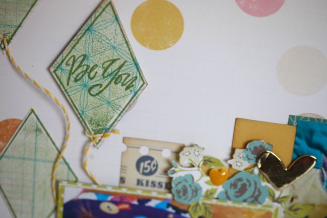
For the kites at the top of this page, I wanted to try using one colour of ink but in two shades, so the text and the outline are stamped with a freshly inked stamp, but the solid block of colour is first stamped on scrap paper so a second stamping gives the paler colour. I love this with stamp sets that have the separate pieces for the outline and the block!
Other supplies for this layout include an older sheet of Cosmo Cricket paper for the background and a mix of Crate Paper designs for the other paper elements. The gold chipboard hearts were in the Studio Calico Essentials line and the enamel dots were from a Prima collection many moons ago.
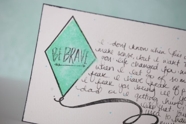
The ‘Be Brave’ sentiment stamp in this set encouraged me to transfer a journal entry to a few 4×6 cards in Wonder Boy’s baby book. Forgive the sappy writing, but basically I wanted to share a very specific memory I have of when I remember that I needed to stop being scared of everything in the world, and how it made a big difference to my life. (Don’t get me wrong: I am still scared of a great many things, but I just remember a very philosophical moment when I was twelve when I let some of the sillier fears go!) Anyway, the stamping: If I use water and Distress Inks for a painted effect, I usually do all the black stamping first then fill in with the colour. I wondered if changing the order would make any difference to the look, and it does. I stamped the solid shape in Cracked Pistachio Distress Ink and then softened it with a paintbrush and plain water. Once that was dry, I stamped the outline and sentiment in black dye ink over the top. It’s a softer look where the watercolour paper had already soaked up all the colour. Not a huge difference, but sometimes little differences are lovely.
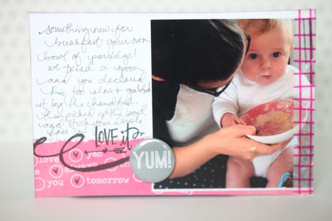
This stamp set also has a lovely ‘string’ for the kites that can be used on its own. It’s a good size for a 4×6 card and adds a nice little flourish to the divide between journaling and pattern on a card for a Project Life album. There are cute words too! (The flair badge is from Hey Little Magpie, the washi tape is from a Studio Calico kit.)
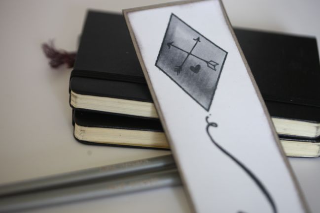
I recently added a few grey Copic markers to my collection, mostly purchased for shading and adding shadows, but I wondered how they would look on their own for something very simple. A quick bookmark with the kite coloured in with those pens plus a generous spray of shimmer let me see how they were blending, but I guess I really shouldn’t use a shimmer-topped bookmark in a library book, now that I think about it.
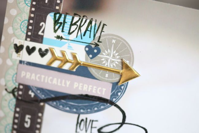
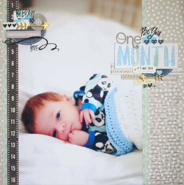
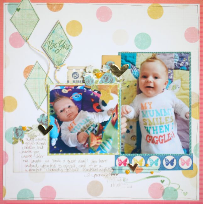
Another scrapbook page! I’m working on a series of pages like this with Wonder Boy’s monthly portraits printed at 8×12, with a description of him at that particular age. I love how the string from the kite and the sentiments worked on a layout like this, where it feels like the areas of embellishment deserve to be extra dressy since the photo takes up the majority of the page. In that detail shot, you can see how my scrapping process makes this a little imperfect, where there is that gap in the stamped image because I’m stamping over the various layers. If this sort of thing really bothers you, just stamp twice – once on the flattest layer (so the photo in this case) and once on your layered embellishment, not yet attached to the photo. Then put the two together so they fit and the image will be seamless. One day I will learn to think ahead rather than just adding things as I go, but that day was not this day and those layers were already stuck in place. Also handy to know: if you’re using a photographic print and stamping with staz-on ink, you can use the staz-on cleaner to remove just the ink from your photo and stamp again. Obviously that will not work with paper, and will not necessarily work with images printed rather than being exposed on photo paper, but you could always test on off-cut or under a layer if you’re not sure. (The difference in those printing methods is something we talked about on the Story-Centered Albums course and I found myself stuck for the names of the different processes. Turns out there is a decent explanation of the two ways to print photos on Wikipedia. I prefer the second option, though I do print some photos at home as well.)
The large stamp set I used here is the alphabet that comes with the Make it Big online class Paige Evans is teaching at Studio Calico. I contributed another page in this series of big photo pages to her class.
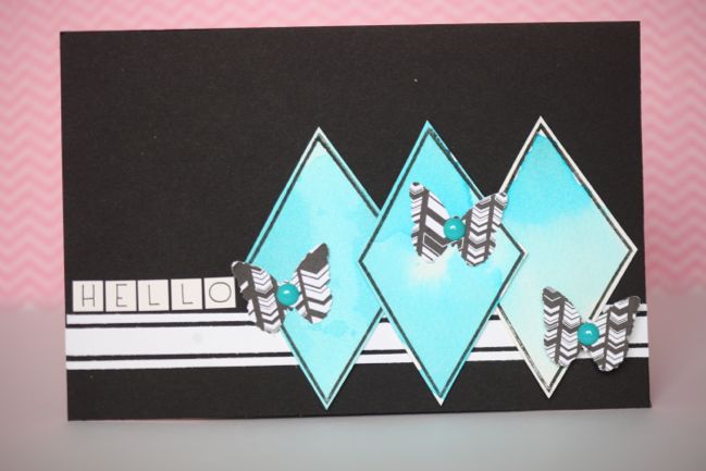
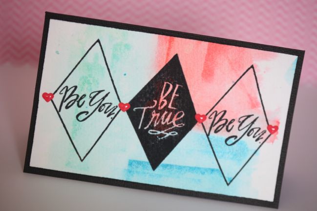
And two quick cards to finish, using Distress Inks as watercolours. Taking some of the other elements away, these stamps take on a bit of an argyle feel that made me want to use just a few diamonds together for simple designs. For the blue card, I stamped the black kite outline on watercolour paper, filled in the shape with water, then added colour from the Mermaid Lagoon Distress ink pad by stamping the ink onto my acrylic block and applying it with a paint brush. Very simple! For the second card, I put the colour in the background by again stamping the ink right onto my acrylic block, but then applying that to wet watercolour paper and just continuing to add ink and water until the three shades blended together. (I used Mermaid Lagoon, Abandoned Coral, and Cracked Pistachio.) Once it was definitely completely dry, I stamped the kites and sentiments on top in black ink. The middle kite with the text in negative needed some cleaning up with a pen because the watercolour paper is quite textured, but it didn’t take much to clean up those lines in the centre. The enamel hearts are from this True Stories pack.
Phew. In the time it took to read all that, I could probably find the kite in the cupboard. Hope you have a high-flying weekend!
![]() Read more about: studio-calico scrapbooking-videos
Read more about: studio-calico scrapbooking-videos
Next post: Ready Set Scrapbook: A new video workshop
Previous post: The Story-Centered Album - A Scrapbooking Course for Listening


