The Power of Three in Scrapbook Design
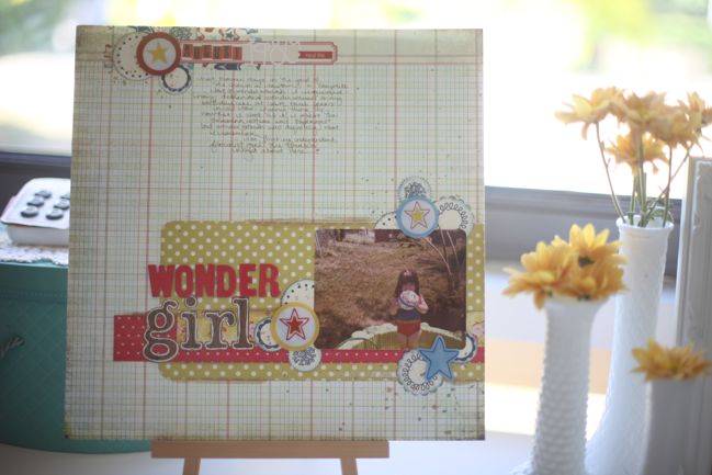
Sometimes I worry about the things I repeat ad nauseum in videos and blog posts. At this point, I don’t really need to tell you that I love the power of three in design. I almost feel like I should just let you have a go at identifying just how many different three-is-a-magic-number moments can be found on a given layout.
But then again, for a long time I felt I was explaining inked edges in every single video and yet I still get at least a couple emails every week asking why I ink my edges and where to get that tool that I use for the job. (It’s the Ranger ink applicator with the foam option, by the way. I wasn’t convinced until I had to demo with one for a convention once, and instantly my mind was changed and I understood exactly why this product existed. No more messy and out of control inking by using the ink pad directly against the paper.) So I will continue to mention the power of three now and then, and I can’t imagine a time when you won’t see me using three areas of embellishment or three splashes of the same colour or three dots in a triangle on most of my pages.
This particular design shows just how much a little grouping of three can dress up an otherwise very simple and static layout design. In this case it’s three circles, but that’s not a necessity. You can replace the circles with any shape of embellishments you like!
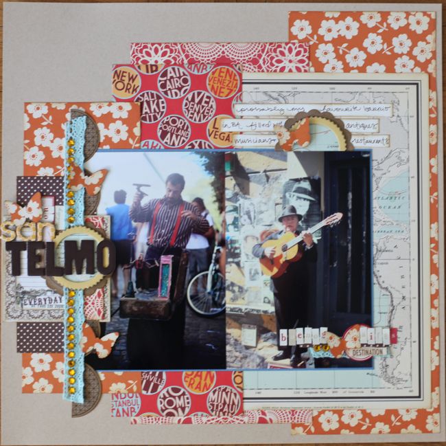
And now for guest artist Christy Strickler, who has unknowingly combined at least three of our challenges into one page!
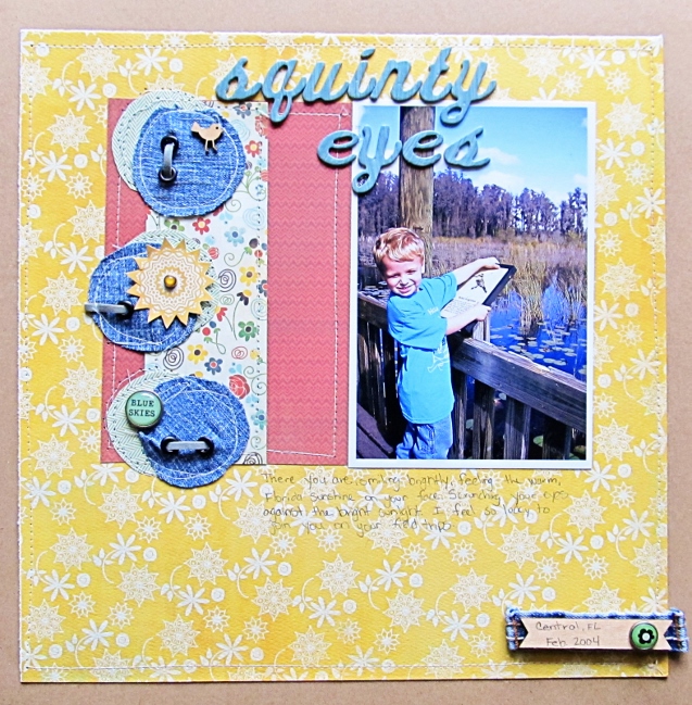
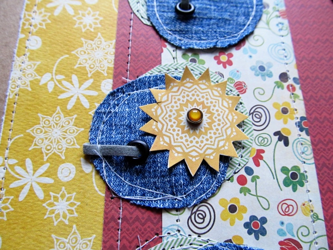
I used to approach scrapbook challenges with a bit of trepidation. This was especially true if the challenge was timed. Experience has taught me that focused choices produce layouts I love in a short frame of time. Today I was challenged to create a layout using eyelets and brads. My first step is always to choose my photos and then my supplies. I make it easy on myself by choosing the first photo that inspires me and the first collection of papers that fit the story. I often create vision boards on Pinterest. Set a time limit and choose an idea to lift. I chose to be inspired by some greeting cards which featured eyelet embellishments (See here ). As you work on your layout, don’t second guess your supply or design choices. Embrace any imperfections as they come along. I like to machine stitch to save time, but I can’t always sew straight. Instead of letting some of the imperfect lines on the circles get to me, I chose to stitch a few extra wonky lines to make it all look intentional. Your goal is always to create a layout with a story to share. Keep focused and don’t let options overwhelm you.
About the Artist
Christy Strickler currently resides in Nassau, Bahamas with her husband, son and three striped island cats. She designs for Scrapbook News and Review Magazine, Get It Scrapped and is a JBS Mercantile Ambassador. You can find her at My Scrapbook Evolution or on Twitter.
Your eighteenth challenge is to embrace the power of three! Entries close at the end of next Sunday, the 12th of May. Please check back on the 14th of May to see if you have won a prize.
![]() Read more about: inspiration-party
Read more about: inspiration-party
Next post: Using paint on your scrapbook pages
Previous post: Scrapbooking with Fabric


