Sketch to Scrapbook Page :: Scrapbooking with a central focus
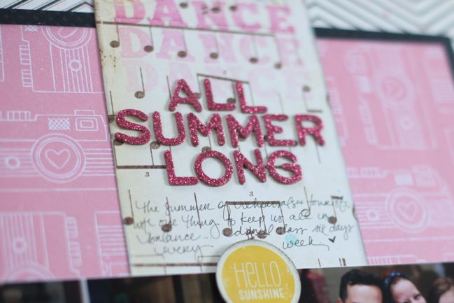
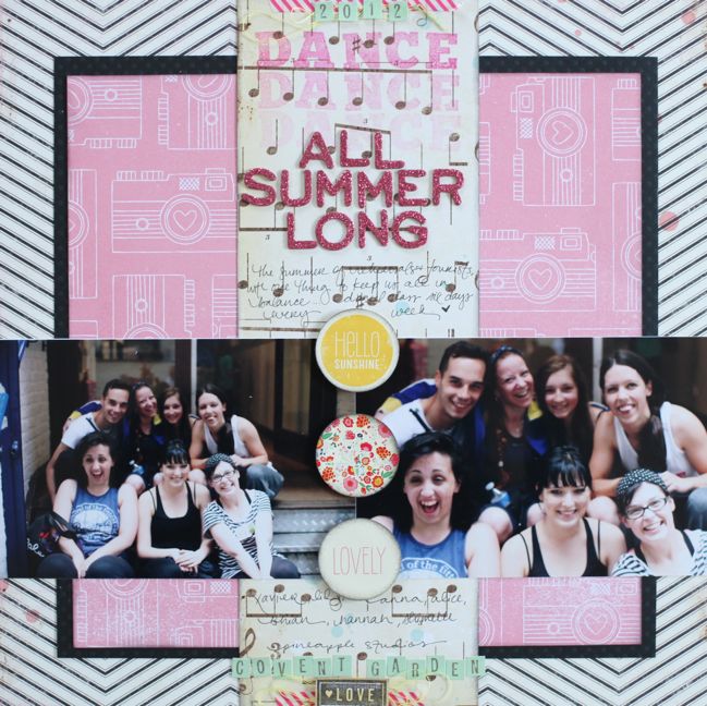
Sometimes a sketch helps things come together so quickly on a scrapbook page, and I think this might be a design I’ll be coming back to the next time I need to scrap without a lot of time to spare. It came together quickly, yet I really like the end result – and often when I scrap quickly I am quite disappointed with the end page. Not this time, so hurrah for that.
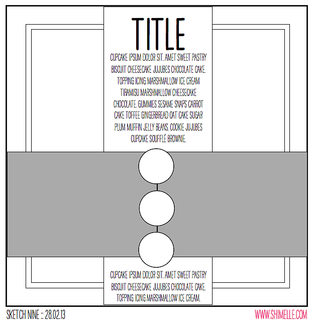
The sketch is designed for two landscape 4×6 photos, a matted square of patterned paper in the background and one tall column down the middle. That column is the same size as the two photos – 4×12. It’s essentially an off-set plus sign, and I’m sure it could be turned and work well too because it’s just basic page geometry of all those rectangles and squares – plus three circle embellishments to balance all those straight lines.
All the supplies for this page come from my March product picks, plus black cardstock, some yellow sewing thread and stamping ink in black and hot pink.
I need to remember that word stamping idea for future pages. I am always lamenting that I have plenty of colours of ink but almost always use the same three ink pads! Definitely liked the bright colour here to change it up, but glad I stamped off that first ultra-strong layer of colour so the tones would be a better match to the patterned papers.
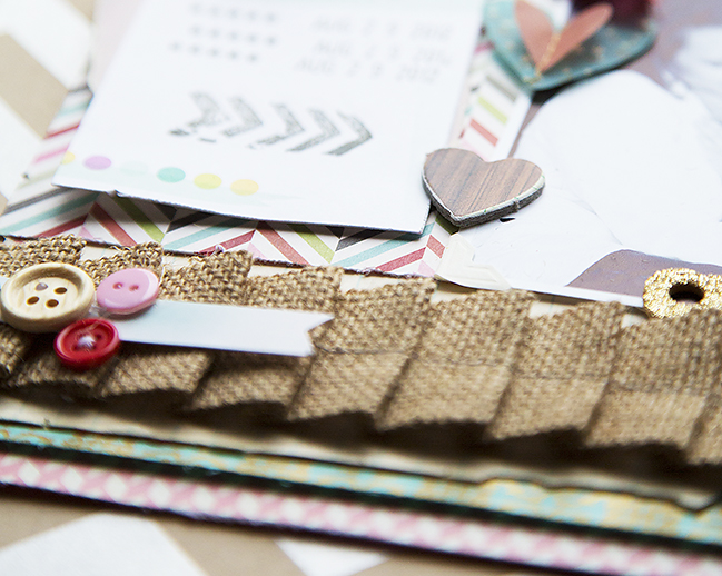
Of course this isn’t the only way you can interpret the page, and today’s guest, Becky Novacek, has her own unique twist – and she shares how she adapted the page from a 12×12 size to her 8.5×11 scrapping style:
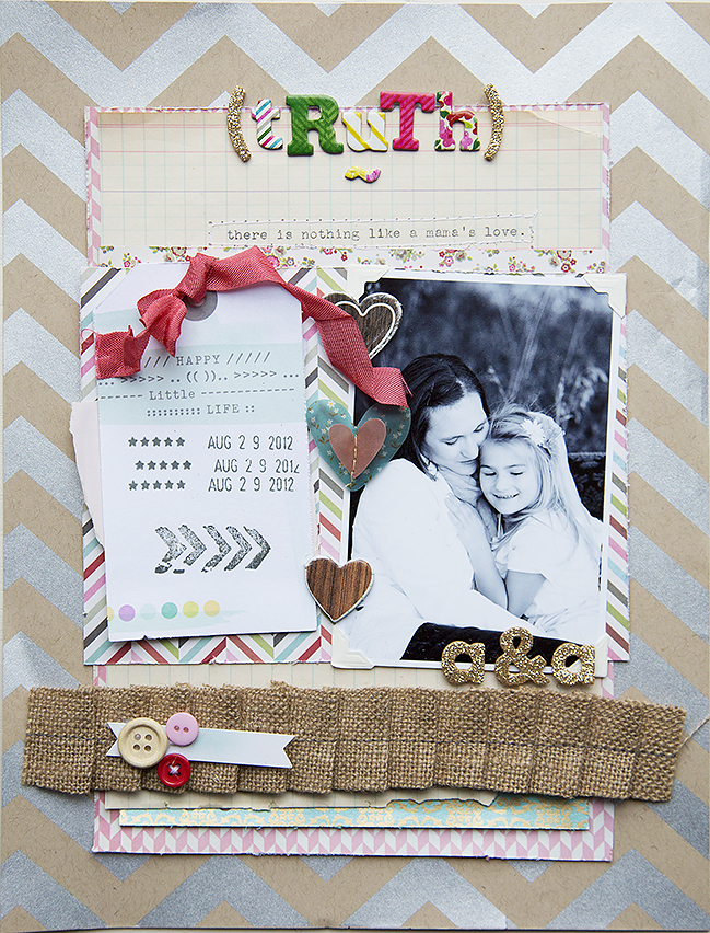
It’s Becky here today, sharing my take on this very versatile sketch, that inspired me a lot. I stayed pretty true to the sketch, although it would have been easy to flip it horizontally. Since I’m an 8.5×11 designer, I found it easy to switch it up to the rectangle versus square design. As I approached this layout using the sketch, I enjoyed using many older products, mixed with new products. I find it gratifying to use favorite older and in the case, no longer available beauties. The background paper and the blue/gold pattern papers were part of one of my favorite Hambly collections. I mixed them with new Basic Grey, Amy Tan, Dear Lizzy, Crate and American Crafts, as well as a really fun Pam Garrison stamp. I switched the circle embellishments to hearts.
Becky Novacek lives in Fremont Nebraska with her husband Tom and faithful dog Scooter. Tom and Becky have 4 grown, married children and ten grandchildren. Becky has always been drawn to paper and photos. As she tried different creative endeavors and eventually discovered scrapbooking, she was hooked. It became an almost daily respite after a long day of work in the beginning, and now it has become an important part of her daily work. Creating free style, homespun layouts that speak her thoughts are what she enjoys most about scrapbooking. You can see more of Becky’s work and daily ramblings at Becky Novacek Photography. You can also follow her on Instagram and Pinterest.
And now it’s your turn! Create a page in your style with this sketch, post it online, and share it with us. You can upload to your blog or to a scrapbooking gallery like Two Peas or UKScrappers, then just follow the steps to link to your project wherever it can be found online!![]() Read more about: sketch-of-the-week best-of-both-worlds-kit
Read more about: sketch-of-the-week best-of-both-worlds-kit
Next post: Glitter Girl and her tips for mixing patterned papers and other scrapbooking supplies
Previous post: Using up the last scraps from a scrapbooking kit


