Sketch to Scrapbook Page :: Scrapbooking two 4x6 portrait photos
I have my work cut out with me creating posts for all the remaining CHA booths and I’ll be on that straight away now that I’m back home in snowy London! (To be fair, Southern California wasn’t that much warmer, though there was a great deal more sunshine.) And to make up for a bit of lost time while I was off staring lovingly at all the new paper for 2013, this weekend I have two scrapbooking sketches for you – both with videos and guests, of course.
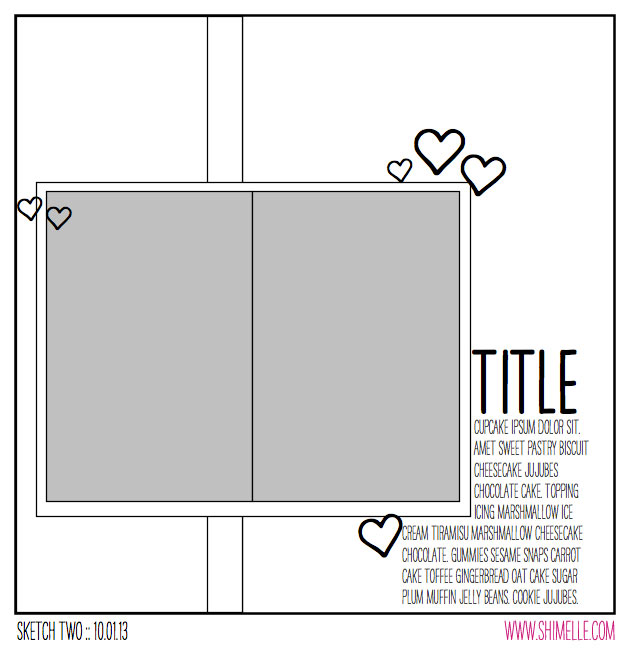
This second sketch of the year uses my favourite photo combination: two 4×6 prints in the same direction (portrait, in this case). It stays pretty simple from there too: a title, writing space, and three areas of embellishment. Of course, what you choose for those embellishments is totally up to you!
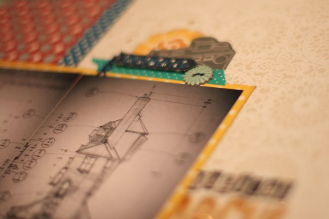
This is my second page to come from my January kit, though you might have noticed Glitter Girl sneaking a title from my kit lettering options last week. I added some thread and a tiny bit of gold mist (it sells out fast but it is restocked often – click the ‘request & notify me’ button if you’re still searching for some and that way you have a good chance of catching it as soon as it arrives), but everything else is from the kit.
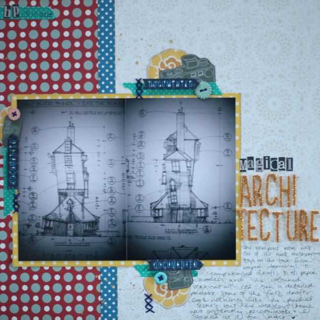
I did add one tiny bit of additional embellishment not on the sketch – two initials and the date at the top left corner. I like having just a few things that repeat on every page in a specially themed album, and in the Harry Potter album, it’s the initials ‘HP’ somewhere on each page. It just seemed a bit more balanced to place them in the top corner rather than add them into one of the existing areas of embellishment since those three were so similar and the initials would make one grouping so different.
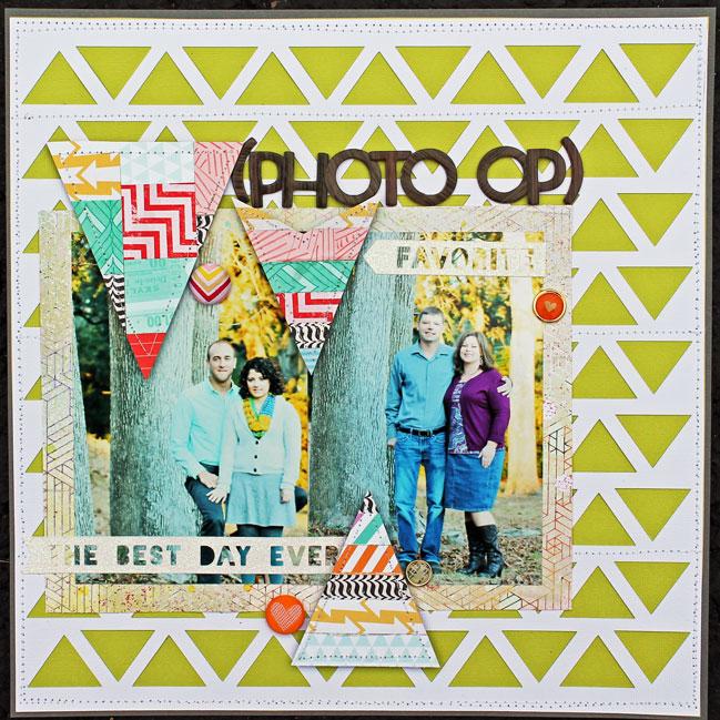
The scrapper behind this gorgeous page is this week’s guest, Melissa Mann. I love how she repeated one motif in two unique ways through the die-cut background and the patchworked embellishments.
I loved that this sketch included two 4×6 photos. I usually stick to one photo scrapbook pages or multiple smaller photos. I stuck pretty close with the sketch but changed the place I put my title. It didn’t seem to flow as well with the title in the lower right hand side. That is the one thing I love about sketches! You can duplicate the sketch in its entirety or use it as a jumping off point. I really wanted to use the lime green card stock on this layout, but it was too bright in my opinion to use as the base. I layered it on top of some dark gray card stock and stitched it down with my sewing machine. I then layered a piece of white card stock that I ran through my Silhouette Cameo and cut a triangle design on and stitched it down on top of the lime green card stock. I matted my two 4×6 photos with a piece of patterned paper that had more geometrical designs on it. I created my own custom arrow embellishments by cutting the arrows out of cardstock. On two of the arrows I layered strips of paper across and trimmed off the excess. On the biggest arrow, I punched out squares of patterned paper and laid it down on top of the cardstock and again cut off the excess. All three arrows were stitched around the border with my sewing machine. A couple of stickers and brads were placed around the photo and the title was placed above the photo mat. The supplies I used are by American Crafts, Studio Calico, Basic Grey, Ki Memories, Tim and Beck, and October Afternoon. The cut files used were by Studio Calico and Silhouette.
You can find more of Melissa’s work on her blog or her galleries at Two Peas and Studio Calico.
And now it’s your turn! Create a page in your style with this sketch, post it online, and share it with us. You can upload to your blog or to a scrapbooking gallery like Two Peas or UKScrappers, then just follow the steps to link to your project wherever it can be found online!
![]() Read more about: sketch-of-the-week best-of-both-worlds-kit
Read more about: sketch-of-the-week best-of-both-worlds-kit
Next post: Sketch to Scrapbook Page :: Scrapbooking with two photos in quadrants
Previous post: Introducing a new scrapbooking line from Dear Lizzy: Lucky Charm


