CHA Winter 2012 :: Lily Bee Studio

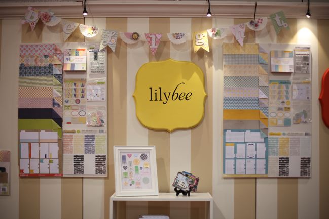
Lovely, lovely things from Lily Bee Studio, including probably my favourite colour scheme of the entire show. But before I hyperventilate about that, let’s just start at one end of the booth and take it in sensibly. I’ll try to act like a grown-up. (This is exceedingly difficult around vast quantities of pretty paper, I assure you.)
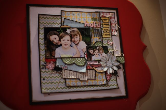
Just a note to start: the Lily Bee design team makes amazing pages and projects to be displayed. This is two shows in a row where my favourite layouts are found here on the LB booth.
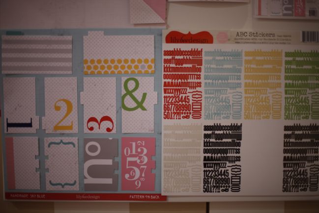
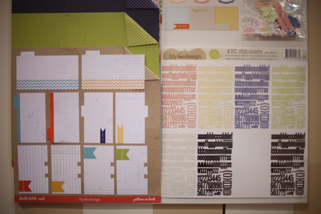
This first collection is called Handmade, and each collection includes those fabulous little letter sheets that go on for miles and miles of titles as well as a pack of tabbed index cards… perfect for pages, minibooks and divided page protectors.
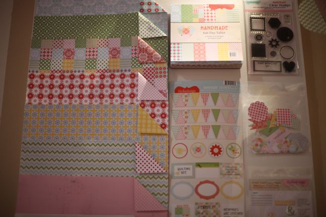
A look at the papers, stickers, stamps and die-cuts in the Handmade collection. Pink and red together is always something that makes me happy.
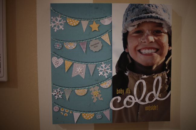
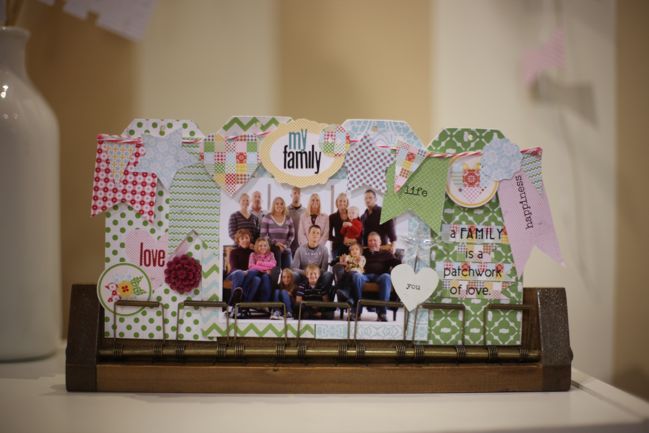
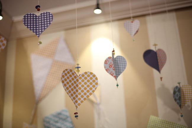
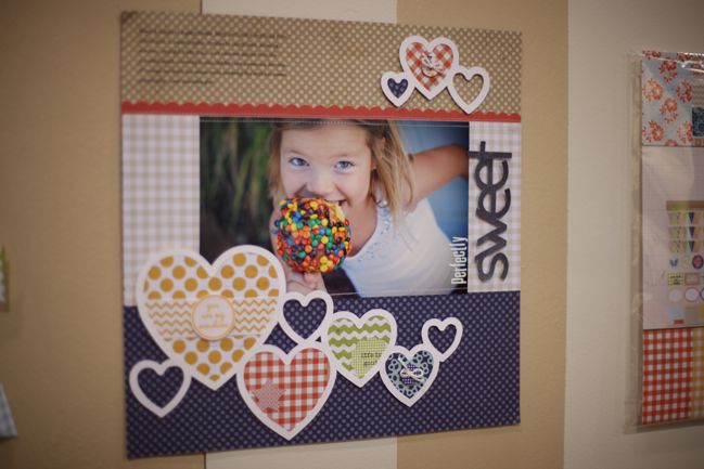
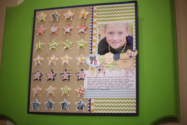
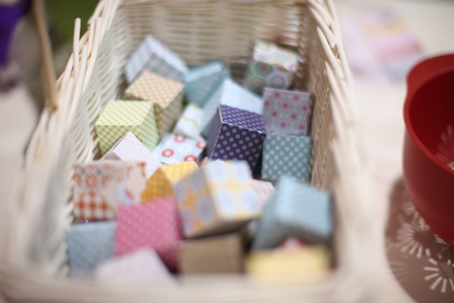
See? I told you the Lily Bee design team totally brings it. Always.
Next up is Double Dutch, with blues and oranges and lots of gingham b-sides.
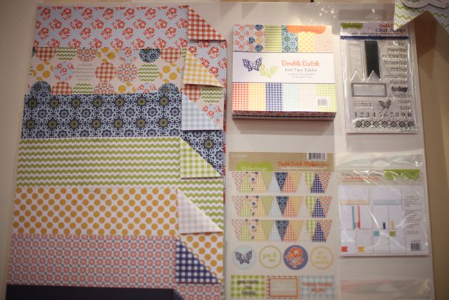
That stamp set at the top right includes a solid and an outline for the banner. Stamp sets like that are some of my favourites – stamp the solid in a pale colour then stamp the outline over the top in a darker colour. It doesn’t matter one bit if you get them perfectly lined up – it still looks really cool if they are off a bit. Sometimes it can even have a look similar to an old printing press.
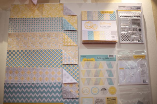
Buttercup!!! This is my favourite. Teal. And. Yellow. I can’t wait to scrapbook with this. So glad to see this colour scheme on the floor.
And that stamp set at the top right?
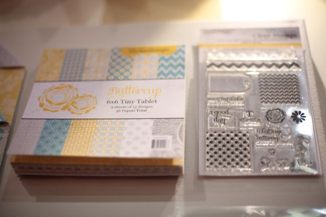
ALL KINDS OF CHEVRON. Oh yes.
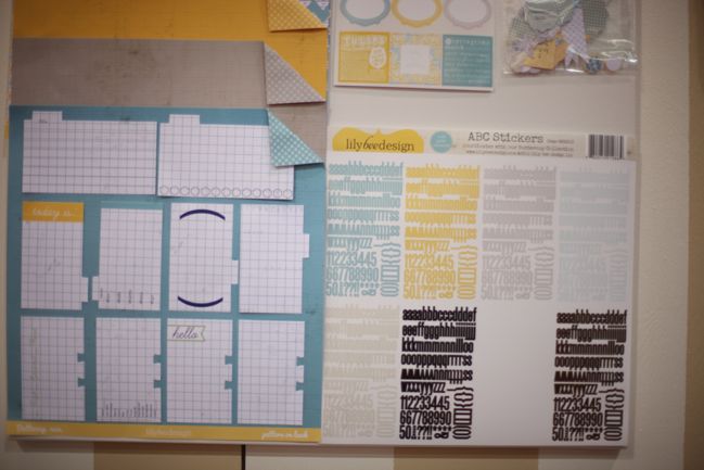
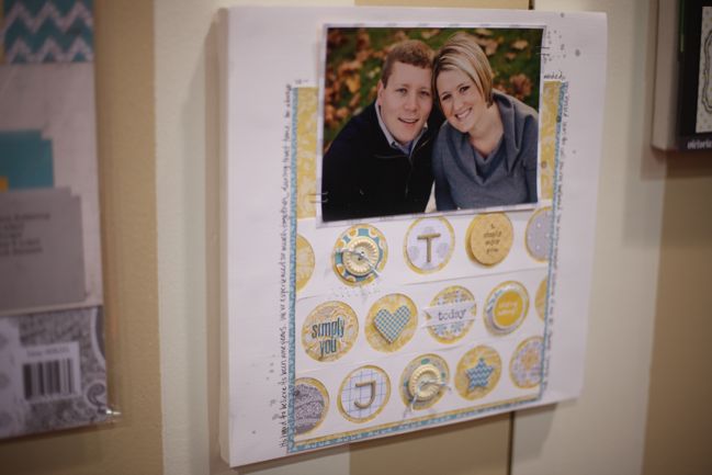
Plus letters, index cards and gorgeous layouts! Buttercup is a win all-round.
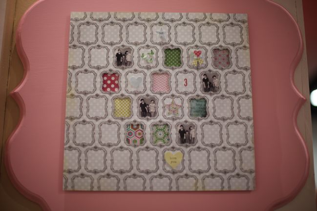
Okay, one more collection but before I show you the products, make a mental note of this project. I have so many papers with a similar design like this – frames printed all over a page, essentially. And even if I didn’t, something like this could be made with a stamp. But I never would have thought to cut out some of the frames and layer things behind the patterned paper. I love how this is just the perfect amount. I have a feeling I would have added to much. But this is just right.
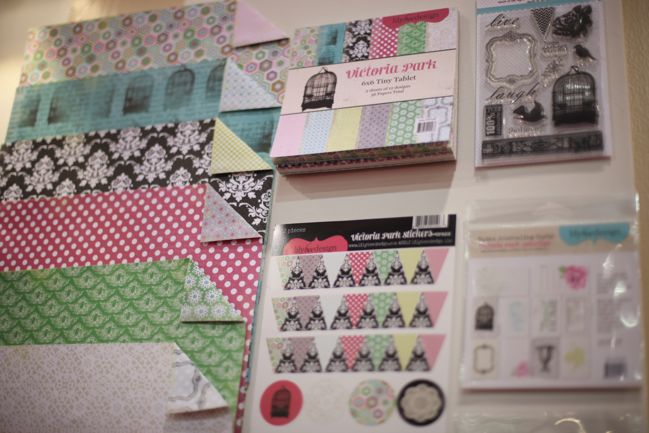
And that final collection is Victoria Park, with a mix of brights and black for a dramatic yet playful look. Can something be both dramatic and playful? I’m going with yes.
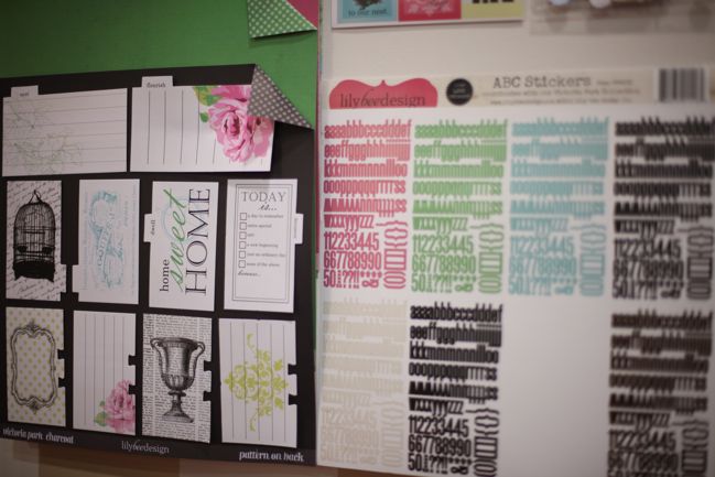
And the Victoria Park index cards are the most embellished. I think this could be a good set if you have a more elegant style but still want to do something like Project Life. Intriguing!
These new Lily Bee collections begin shipping to stores at the beginning of March.
Click here to shop for Lily Bee Studio products.
If you’re attending the show, find Lily Bee at booth 1690.
![]() Read more about:
Read more about:
Next post: CHA Winter 2012 :: Smash Books
Previous post: CHA Winter 2012 :: October Afternoon


